Press "Enter" to skip to content

Select Indistinct

Reading about Python’s Poetry

Poetry bills itself as “Python packaging and dependency management made easy” – I will dive in a bit more…

Installing and configuring

  • Poetry requires Python 3.8+ (that’s a lot of missing Python)
  • Has the classic “fun” insecure installer approach by default curl -sSL https://install.python-poetry.org | python3 – not my favorite, but it looks like Poetry has its own bootstrapping problem right now.
  • Uses the pyproject.toml format for configuration, with the tool.poetry, tool.poetry.dependencies, and build-system are the most important starting fields.
    • Poetry has a pretty well-thought-out use of the pyproject format.

Commands and Usage

  • Initializing an existing project is as easy as poetry init it will ask you questions about your package and get your boostrapped.
  • You can add packages with poetry add and poetry remove, first blush it feels like I am using cargo.
    • Upon upgrade/change Poetry removes old packages.There are a few GitHub issues about it, so if you are Windows and you want a faultless experience you might want to skip Poetry for now.
    • This will also resolve the package versions to ensure compatibility – a clear positive knowing your packages work out of the box together, but I have burned by Conda before, so a package solver always gets some side-eye.
  • poetry install grabs the packages and installs them in your environment.
  • poetry update Gets the latest versions of the dependencies and write them to your lock file.
  • poetry run runs the command within the current virtualenv.
    • This combines with the tool.poetry.scripts section of the pyproject file – you can define a file to run and then poetry run special-command to run your special-command.
  • poetry shell spawns a shell in the virtual environment (really useful for testing random stuff).
  • There’s a few more commands around lock files and more esoteric needs for the build system, so I will stop there for now.

Other interesting differences from a simplified pip env

  • Poetry is much more active in managing environments than a simple pip+venv setup, and actively takes steps to activate/validate the version of Python and your current environment when running code.
  • There’s a bit more on the type of build tools you can emit, versioning, and dependency groups which you generally wouldn’t have in the simpler tooling modes.

Final Thoughts

Overall my first blush with Poetry is that it’s a very cool tool (if you are not on Windows) and that it definitely seems that once it’s set up. It seems like you’d have more luck getting new packages added to existing projects without the “fun” of Python packaging issues arising suddenly in the wild (or hopefully your full featured test suite)/

Because of the file deletion issue (and me on Windows most of the time) I am still going to be sticking to pip+venv. Any add/remove command has about a 50% chance of going south for the boxes I am using.

A Simple 5x Speed Up With My Django Testing

the statistics in pycharm showing that the built-in method of _hashlib.pbkdf2_hmac is taking 36.4% of the time
PyCharm Profile Stats

More than a third of the time was taken with a hashlib function. My current testing regime doesn’t take long (about 3 seconds on my slow machine) but any iteration time is precious when you are working on your side project.

Before I wax poetic, here’s the changes you’d make to your project’s settings.py

 
# This is only needed if you don't already have a PASSWORD_HASHERS list in your settings 

PASSWORD_HASHERS = [
    'django.contrib.auth.hashers.PBKDF2PasswordHasher',
    'django.contrib.auth.hashers.PBKDF2SHA1PasswordHasher',
    'django.contrib.auth.hashers.Argon2PasswordHasher',
    'django.contrib.auth.hashers.BCryptSHA256PasswordHasher',
]

# DO NOT USE INSECURE HASHING OUTSIDE OF DEBUG MODE OR YOU WILL GET HACKED
# All of your data will be stolen and all of your good works undone 
# Avoid having your company added to this list https://haveibeenpwned.com/
if DEBUG:
    PASSWORD_HASHERS.insert(0, 'django.contrib.auth.hashers.MD5PasswordHasher')

So what’s happening here?

Context

If you’re fairly new to Django you might not know the settings.py file controls the general configuration of your application, and defines arbitrary values available from the settings module (a really useful feature!)

The DEBUG value is set for test environments (earlier in the file) based on environment variables that I control, if you want to learn more check out the DEBUG documentation.

Most values that could exist in your settings file have sane defaults, but it can be a bit confusing that not everything is there at once. If you dont have a PASSWORD_HASHERS list in your settings Django will pick whatever the “right” option is.

In this case we’re defining the standard items and then inserting a new default hash option in the list (during DEBUG mode only.)

This sets PASSWORD_HASHERS to reference a very fast and very weak (full list here).

Using the PyCharm test UI I found my slow machine testing went from 2987ms to 526ms, and improvement of  >5x!

The observer effect is in play for the statistics but we still show the entire hashing process gone from the stats:

PyCharm profiler statistics showing no hashing algorithm in the top items and a much faster result
PyCharm Profile Stats … Much Better

It’s worth repeating – don’t run insecure hashing such as md5 algorithms in production ever. It’s the difference between your password being cracked in seconds and making it impractical for decades or centuries.

It may seem weird, but being purposefully slow is an important feature of cryptographic hashes that you should not attempt to defeat.

If you want to learn more about how cryptographic hash functions work check out Practical Cryptography For Developers.


Reversing posexplode in SparkSQL

I had a table with many instances of a primary key and an array. I needed to return one row with an averaged array in SparkSQL.

To average an array we just average each value independently, but managing nested types in SQL is notoriously a PITA. I searched around and didn’t find any good answers on StackOverflow or the net that I liked, so I thought I would take a crack at a “pure” SQL approach.

First idea – what if I could explode the values and then reassemble them, grouping by the ordinal and averaging the values?

Cool idea! The problem is that Spark has no ordered array rollup function (at least that I understood reading the docs and SO)… so what can I do to deal with that? Am I stuck?

I reviewed the SparkSQL function documentation and realized I didn’t have any magic bullets, so I reached back into my SQL hat and asked myself “How I would force ordering without an ORDER BY?”

  • What about a subquery for each element in the array? A correlated subquery would “work”… in the most disgusting way possible.
  • Well, we could emit a big ol’ case statement I guess…
  • Or wait, isn’t that just what I always tell people to use instead of … PIVOT?

Ok, let’s try this:

#1
card = spark.sql("select size(array_col) as size from array_table").first()["size"]

print(f"We see the arrays have {card} dimensions.")

#2
cols_as_values = ', '.join(str(x) for x in range(card))
cols_as_cols = ', '.join('`' + str(x) + '`' for x in range(card))

query = f"""
select 
  avg_arr.primary_key, 
  array({cols_as_cols}) /* #6 */
from
( 
select 
  t0.primary_key, 
  ord, 
  avg(val) as avg_val 
from array_table as t0 
lateral view posexplode(array_col) as ord, val /* #3 */ 
group by 
  t0.primary_key, 
  ord /* #4 */
) as avg_arr
pivot
(
  first_value(avg_val) /* #5 */
  as avg_dim_val for ord in ({cols_as_values})
)
order by primary_key
"""

For those with Databricks or Databricks Community Edition (free as of this writing) you can also review and fork the notebook here.

Yeah this is ugly, but its significantly faster than the similar code running the same steps with a numpy udf, I need to do more testing to make this claim a bit more solid.

Learning SQL, 2nd Edition – Creating tables as described in the book

The Premise

Had a conversation discussing a book that I actually studied myself… 10 years ago – a truly venerable publication. It came up that the table creation descriptions at the beginning of the book which I remember using … actually don’t exist.

I’m going to walk you through understanding the descriptions as provided, and a little guide to do the same with random data you find.


The Data

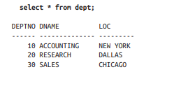
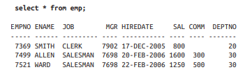
In the book we see the following two sets:

In the dept table, we have a DEPTNO, DNAME, and LOC (department number, department name, and location respectively, database people love shortening things)

In the emp table we have EMPNO, ENAME, JOB, MGR, HIREDATE, SAL, COMM, DEPTNO

Now – depending on if you’re learning SQL Server, SQLite, postgres, MySQL, Snowflake, etc – there’s going to be a slightly different syntax for creating tables, selecting data, and rest – so keep your official documentation open and learn to love it.

For my example I’ll be using SQL Server so here’s the documentation on CREATE TABLE for SQL Server.


Our Process

First, we’ll declare and name our tables, then we’ll add the columns we need, and finally we’ll pick the types we want to use.

This is all boilerplate except for the emp and dept portions respectively – we’re saying create a table called emp and another called dept in the dbo schema with the following columns in parenthesis.

CREATE TABLE dbo.emp();
CREATE TABLE dbo.dept();

Pull out the columns from the dataset and put them in their respective table.

CREATE TABLE dbo.emp(EMPNO, ENAME, JOB, MGR, HIREDATE, SAL, COMM, DEPTNO);
CREATE TABLE dbo.dept(DEPTNO, DNAME, LOC);

Finally, we want to define a data type to act as an appropriate box to place the data.

A well chosen data type maps well to the current and potential values in the column, and the more strict you can be about choosing smaller types or constrained values the more likely you’ll avoid nonsense data. In some cases it can also greatly improve performance.

Now, we’ll start with a very pragmatic approach (for time purposes) and I will leave you with a challenge at the end of the post!

Crack open the SQL Server Data Types as your reference, learning to read the official docs is invaluable.

The main categories are:

  1. Exact numerics – Exact numbers, use these.
  2. Unicode character strings – Modern text, use these.
  3. Approximate numerics – Generally avoid unless you need floating point math.
  4. Binary strings – You’ll know when you need them.
  5. Date and time – Useful for common date and time operations and comparisons.
  6. Other data types – Some useful, some weird, you’ll probably use uniqueidentifier and xml soon enough.
  7. Character strings – Less common these days but if you have specific types of data it can save you space.
Based on our screenshot above I see numbers with no decimal points or special notation that are “smaller” (Exact Numerics > INT) , I see a date that has no time component (Date and time > DATE), and some words that might be user input (Unicode character strings > NVARCHAR).

What does that leave us?

CREATE TABLE dbo.emp(EMPNO INT, ENAME NVARCHAR(50), JOB NVARCHAR(50), MGR INT, HIREDATE DATE, SAL INT, COMM INT, DEPTNO INT);
CREATE TABLE dbo.dept(DEPTNO INT, DNAME NVARCHAR(50), LOC NVARCHAR(50));


Importing Data

Before we make this any more complicated, let’s go over simple ways to import data.

There’s MANY data connectors and other methods you can use to INSERT data into a table, but if you’re just starting most of them feel pretty hard to me to bootstrap.

If you’re familiar with these methods then ignore this and move on, but if you don’t have experience using these tools and if you’re dealing with less than a few hundred rows of data here’s a simple way to accomplish your goal that almost anyone can do.


Disclaimer: Don’t this forever folks, there’s many faster and simpler ways once you have more programming chops, but we used to use this all the time in the support world.

This will also break on weird inputs with single quotes (you can replace them) and tabs (when you paste between environments they might think there’s extra columns.)

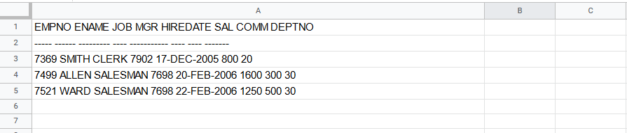
Crack open Google Sheets or Excel(if you have it) and copy/paste your data from the book/data source into it.

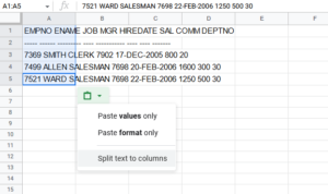
If you look closely you can see that all of our data ended up in Column A – this is bad!

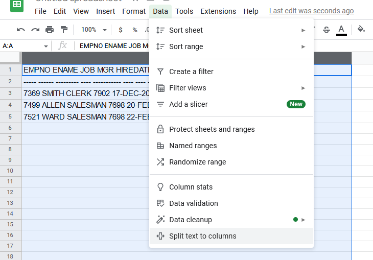
Either use the clipboard icon in the lower right or the data tab to split text to columns. You can find a similar option in Excel.

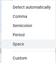
In Excel we’d choose a tab as the separator, but Sheets makes it simpler when choosing what breaks things apart – for this data make sure to choose space.

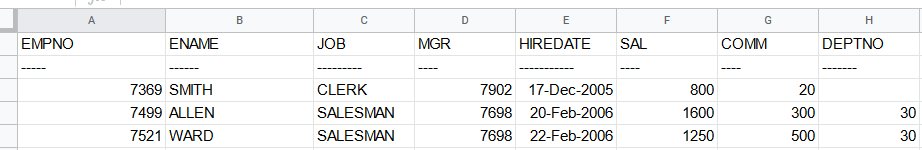
After the separation, we can see that each piece of data ends up in own column, awesome!


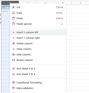
Next, we need to make space between each column for some additional SQL syntax, so right click on each column and insert 1 column left.

When we’re done, go ahead and remove the top two rows:

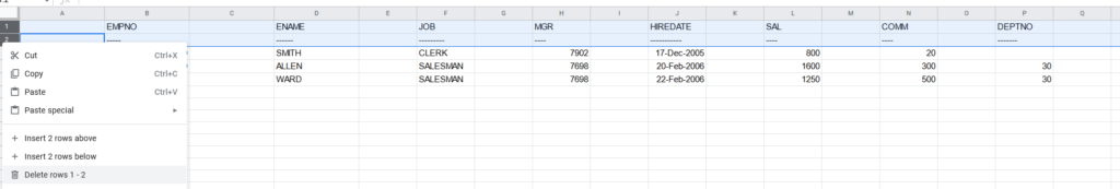
This should leave us with just the data.

Next we want to add some code: in the first column and first row you type SELECT ‘

The next (and each) row you copy paste UNION ALL SELECT ‘

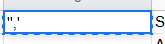
In every other new column you add a quote and a comma, but in both Excel and Sheets if you want to start a cell with a single quote you need to write a double single quote – ”,’ and ” respectively, your cells should look like:

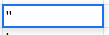
When you finish your sheet should look like this repeating down as far as you have data.

Now here’s the interesting part – if you select all the data and copy/paste it into SSMS you’ll have a valid SQL statement (with one small flaw!)

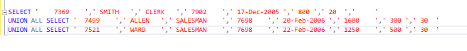
So what’s the problem? Well the spreadsheets of the world tend to export tab separated data. So we want to remove the tabs.

How do we do that?

In SQL Sever Management Studio there’s a Find and Replace option with a special little feature – regular expressions.

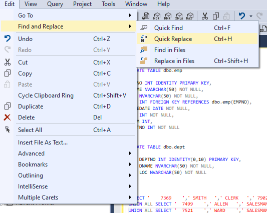
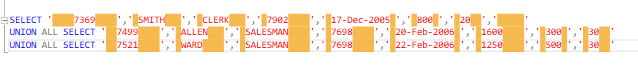
We’re not going to do anything fancy, just click the star (to enable regular expressions) type \t into the find field, and nothing into the replace field. Click the far right Replace All button and watch the text tighten up.

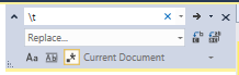
Add your INSERT statement with your table and list of columns to the top of your data and you’re ready to rock!

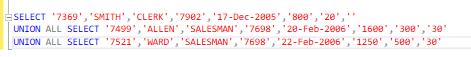
INSERT dbo.emp(EMPNO, ENAME, JOB, MGR, HIREDATE, SAL, COMM, DEPTNO)
SELECT '7369','SMITH','CLERK','7902','17-Dec-2005','800','20',''
UNION ALL SELECT '7499','ALLEN','SALESMAN','7698','20-Feb-2006','1600','300','30'
UNION ALL SELECT '7521','WARD','SALESMAN','7698','22-Feb-2006','1250','500','30'

I leave it to you to do the same on the dept table, its a lot less columns!


Final thoughts

We could add much more to this table declaration – we probably don’t want to create an employee with no name, or an employee with no department, or delete an entire department accidentally!

The create table syntax is flexible to handle these cases and more – declaring indexes or relationships can make a table much more powerful to model your problem and prevent misuse.

CREATE TABLE dbo.emp
(
  EMPNO INT IDENTITY PRIMARY KEY, 
  ENAME NVARCHAR(50) NOT NULL, 
  JOB NVARCHAR(50) NOT NULL, 
  MGR INT,
  HIREDATE DATE NOT NULL, 
  SAL INT NOT NULL, 
  COMM INT, 
  DEPTNO INT NOT NULL REFERENCES dbo.dept(DEPTNO)
);

CREATE TABLE dbo.dept
(
  DEPTNO INT IDENTITY(0,10) PRIMARY KEY, 
  DNAME NVARCHAR(50) NOT NULL, 
  LOC NVARCHAR(50) NOT NULL
);

There’s still plenty we could do to make this table declaration better! If you’re still reading and learning and want a starter challenge –

Can you figure out the optimal length for our NVARCHAR fields given the data in the book?
Can you write a SQL query that can tell us how long the fields should be?

Fixing – Error: “PKIX path building failed: sun.security.provider.certpath.SunCertPathBuilderException: unable to find valid certification path to requested target

During my attempt to connect PyCharm to a SQL Server data source with Windows Authentication and ran into a slew of errors. Upon searching I noticed there was a dearth of resources on this issue.

Some posts mention messing with your certificate store but with a local sever I dont have the interest in configuring certificate based auth.

From experience I knew a security issue reported in SQL Auth generally is related to the certificates/encryption settings on the connection, often turning it off works fine (don’t do this in production.)

I found nothing useful in the SSL/TLS – clearly the standard “uncheck encryption” trick isn’t managed here.


Looking further I found the Driver: section, here the MSSQL driver settings I needed are available.

picking advanced/driver settings


Click the Advanced tab.clicking the advanced tab in the driver settings


Update integratedSecurity to true and encrypt to false. changing pycharm driver settings


This fixed my authentication issues with the local server.connected window

Predicting When Your SQL Server Will Run Out Of Space via Colab, Plotly, and Pandas

No, not Azure Data Studio or Databricks notebooks (yet) – I wanted to give Google Colab a spin and the big G hosted Jupyter notebook has an expansive free tier with more RAM than my work computer and a graphics card attached to boot!

Going forward with my explorations I wanted to make use of an open-ish dataset, so I used Stack Overflow via Brent Ozar’s blog post on getting the data

Keep in mind its almost 500GB (zip + extract) – and while in an ideal situation we wouldn’t be torrenting a database, extracting, attaching, querying, etc to get at our insights I’ve honestly seen slower iterations at many enterprises so it wasn’t a big deal for me.

If you’ve never used Stack’s database its worth mentioning you an also avoid this all by running queries on their own servers at the Stack Exchange Data Explorer. There’s more tables there too!

If you just want the notebook code click here!

An SSMS object explorer view of the tables in Stackoverflow with only 12 tables
Turns out you can run a global website on 12 tables?

If you haven’t touched Stack’s database before you might be surprised how svelte it is, the backup I am working with only has 12 tables. That’s right, just 12.

The truth is that you don’t need to make things complex to make a useful product, and of course Stack/Brent have removed some ancillary and internal things which is fine by me.

The first question I wanted to model out was a bigger issue with on-premises databases – when are we going to run out of storage?

Back in the day I’d cheat with msdb backups, comparing compressed sized to actuals, and moving on. However I don’t have a historical reference for Stack Overflow… so what can I do?

Taking a look at the tables we see a commonality in many tables – CreationDate! It looks like the rows faithfully are stamped when they are created.

We might not be able to truly look back in time but if trust the database we have a chance to query the contents and get back some interesting data about Stack.

So let’s head over to the notebook if you like, or sit back and read more.

Initial overview of the SQL Script

The first text block contains the dynamic SQL to query the tables with CreationDate and construct additional queries to run – I could have automated this or added a cursor but given I am running it locally in SSMS and copying the CSV by hand today, it wasn’t worth it.

In our first code block ([25]) we install plotly==5.2.1 because of some newer and nicer features, setup the file upload of the csv([36]), and define the headers because SSMS is too lazy to include headers([37]).

Installing pre-reqs and uploading files
Installing pre-reqs and uploading files.

Next in code block ([38]) we define a DANGER_ZONE, the constant that should make us very worried because that’s how much space we have (in megabytes), and add a function to add DANGER_ZONES to figures easily.

Summarizing individual data tables

We make a line figure, render it, and we see something!

DANGER ZONE added with tables.

We’re obviously not done yet, we’re going to need add some data to predict when this is going to fail.

In code block([39]) we sum and group the RunningTotalMBUsage values such that we get an overall value for each month’s total megabytes for all tables.

Add overall summaries of the values to the dataframe.

And happily in code block([135]) we see that we have our overall graph looking good, though obviously its a bit closer to our DANGER_ZONE!

Add overall summaries of the values to the dataframe.
Overall line added to the graph

Finally, in code block ([136]) we take all the lessons we’ve learned and project out a set of points to determine what a linear best fit line would look like.

Regression fit again actual measurements.

Conclusions

Given a 500GB limit, we can see that a prediction of April 30th, 2026 is given for Stack’s storage being overwhelmed – and if you look closely you can see that Stack’s growth of data isn’t strictly linear, so it’s probably going to happen sooner than that. In reality I bet they have at least twice as much as that available 🙂

I had a good time using Colab, and the only frustrating moment during the process was when my sign in timed out, it silently switched me to a new login context and couldn’t save, porting that back over got annoying for a bit. Otherwise its great!

Feel free to copy/fork my notebook if you want to make the same predictions for you environment and try it out for yourself, I know I will. And if you were wondering, yes, I was listening to Kenny the entire time.


Oh The Visualizations I’ve Seen

Over the last few years moving into more senior data roles I’ve gone from schlepping spreadsheets back and forth to having to justify and plan long term projects, simply distributed systems to management, and monitor for impending doom (ORDER BY most_impending).

Working through those problems I have found (mostly in desperation) that visualization allowed me to communicate much more easily than words alone, and meetings around problem solving ended much more quickly when we had a viz to hang our thoughts on.

This work didn’t happen overnight, so I wanted to share some resources I love as well as some practical implementation work.

First – I want to share some rules from a wonderful book Storytelling With Data – A Guide For Business Professionals recommended by one of my data favorites Steph Locke.

Understand the context you’re speaking into.

Picture it: We’re in a brand new startup, working hard solving the problems of the day.

An influx of capital occurs, and huge televisions are purchased for all our new fancy dashboards we are going to create!

We start focusing on throwing up our immediate service issues, but with a few days of work the boss sees our progress and comes over. They ask us to include the current key performance indicators for the team, it seems like an ok fit, and we do.

The big boss comes down from the most recent sales meetings, sees the work, and calls it good.

Soon people are using the visualization to have discussions and make decisions. This gets noticed. People start asking you to include random metrics to the dashboard to help solve a specific issue, or track the progress of a team.

You make it work, but as the requests start piling up you break down and say “enough is enough!” and everyone’s confused – can’t we just add one more?

More information doesn’t mean better results – it just means more stuff to mentally juggle while you look for what you care about.

Sitting in the car of a Citroen GSA Pallas demonstrating its pointless complication.
Sitting in the car of a Citroen GSA Pallas, the controls are on weird jutting extrusions coming from the dash towards the steering wheel. WHAT IS HAPPENING?
 Aerospace Lancia Beta Trevi dashboard
Aerospace Lancia Beta Trevi – 29 holes with no idea what any of them mean. Less is more.

A common request I’ve heard is that we need a “Universal Dashboard” but if you’ve ever attempting to build one it will soon look like the dashboards in these cars, covered in dials and knobs nobody knows how to use and is probably afraid in many cases to even operate.

Instead of adding the kitchen sink of data, consider starting a new dashboard with asking Who, Why, and How.

Who is going to use this dashboard?
Know the audience for the information and have a sense of the model of the system they are observing.

Why are they going to use it? What problem are they trying to solve?
Are we trying to improve sales, adhere to a service level objective, or track some more ephemeral goal? Remember, we’re not trying to include something based on requirements, we’re trying to solve an actual problem.

How will we fix the problems we find?
This may be significantly harder to identify, and in a dashboard context the answer might just be “page X if Y is above 50% for 5 minutes” or “Buy more servers if capacity X drops below Y” but if you cannot form a plan of action from something you are showing, you probably can toss it.

Choose your display.

Consistent language is extremely important in any communication, and visual mediums are no different. When someone has the urge to increase the complexity of a viz everyone suffers.

Choosing a simple method to communicate what’s happening is critical for “at a glance” reporting.

Let’s take a look at a “good” dashboard example posted online and see what display we’ve chosen and what consistent language we can distill below.

A "good" dashboard that still is pretty busy.
A “good” dashboard that still is pretty busy.

We have some consistency in color (red bad, green good, black normal) but there’s plenty of improvements to be made here… we can see at least 10 different components.

visualization with blue boxes drawn around to highlight the dozen or so areas with data
The “good” dashboard still does too much for my tastes.

We have a food court approach to visualizations; picking a mix of vertical and horizontal charts, waterfall charts, etc – at a glance it’s not clear to me whether performance is good or bad.

I see we have a big green thing in the top right? that seems like a lot of green! I see some red… but what does it all mean together? Is 42% a good gross margin? Some industries that would be great, others awful.

This might have met the requirements for the client’s request, but given we can see 9 tabs below this one implies managing this dashboard could be several full time jobs.

Eliminate Clutter.

It’s might be tempting to make your dashboard “cool” or “compact” or low contrast but when you pack that clutter into your UI you increase the cost for every human lookup. New people are not welcome here.

showing the dell foglight ui which sucked
If you ever used the old Dell Foglight UI then you know what I am talking about.

Given the mental burden we put on our users, ask yourself these questions:

  • Does this element of the data we are showing service the narrative?
  • Can you shorten while remaining unambiguous?
  • Why, instead of why not?
  • Is there a simpler way?

Checking back into just one section of our example dashboard:

  1. In this subsection of the report we often see just a tiny smear of red or green – a lot of space is taken up by useless/invisible data.
  2. There’s no clear reason why we want the line of business doing well and not doing well just generally laid out; immediately breaking down the failing lines of business would yield more value.
  3. We see visual guide lines added to they add a lot of visual noise with the small fonts.
  4. We have both a dollar and percentage change, it seems like a pure dollar would work fine in this case and save half the space.
  5. We have a label that has an alphanumeric identifier when probably just one of those would do.
  6. As with many of these report sections it has the wonderful property of having enough information to make you ask questions but give few answers or leading indicators of a problem except pure profitability.

Draw attention where you want it.

Where’s your eye drawn here? (cheating, I know.)

The big black bar on the lower left takes up so much space that I first thought it was dividing up the page until I saw the off-grey/white bar on the far left. It’s so visually uninteresting that I did not include greys as part of the color palette.

The other obvious first place is visually interesting – red, blue, and black with the only circle on the page.

I have no idea what that circle is trying to tell me, and I constantly find myself shifting to the right to see the bar graph that wants to exist in both the header and the content.

Remember to be very intentional with your colors, shapes, and especially the “flow” of your viz.
Storytelling with Data emphasizes this multiple times and recommends taking a look at both the horizontal flow and the vertical flow for anything that throws off simplified visual processing.

Think like a designer.

Take a step back and review up to this point the goals you started out with and the destination you’ve arrived it.

  • Focus:
    • If you don’t make decisions based on this metric it probably should be on your dash.
    • Reconsider the visual gestalt, there’s so much on this we don’t really know what job function this would even be useful for.
  • Display:
    • Red and green are darlings of “simple viz” but are not accessible for colorblind users. If your dashboard requires the use of color, utilize color-blind friendly colors to ensure your data is accessible to all of your users.

I would consider changing the granularity of this reporting altogether (if the underlying data exists.) In the world of e-commerce having just month by month numbers to drive decision making is not impressive.

It’s also worth asking if PowerBI is the right solution for your problem. There’s a lot of other options for displaying your metrics out there and PBI is a fairly expensive one for the purpose – if you want eye candy then you probably would want to consider spending more time addressing the visual deficits here.

You’re telling a story.

This dashboard serves to tell a user the story of the business’s successes and failures of meeting financial goals. However, the lack of focus makes it difficult to understand what exactly that story is. Focus your story and ensure your graphics are necessary, useful, and accessible to your target audience.

Wrapping it up

I’d like to write more on the topic (and will in the future) but for today it’s gotten verbose and usually I set a flag for that. I leave you with some free (and one paid) tool to try out and remember

  • draw.io – (free) Download the desktop client and save once, it will auto save forever after that.
  • Mermaid.js -(free) An awesome little graphiz implementation with an online editor.
  • yFiles – (no affiliation) I’ve been meaning to put this in a project in the future, it’s the same viz library IntelliJ uses and I LOVE it for database work that I have been doing recently.


Removing Microsoft’s News In The Taskbar

So in a “not shit crap again” post – MSFT releases a “News” update to take up space on your taskbar and just allow Microsoft to serve you more ads.

The boiling of the frog of the modern treatment of privacy is so annoying, so here’s the registry path to disable it.

Cool that you get to open the registry instead of just get presented a “Would you like a new informative tool by Microsoft?” It’s almost like they know that NOBODY wants this.

Remember – dont just randomly run registry files – they are plain text documents interpreted in a special way – so crack them open and make sure you feel comfortable running them.

You can review/download the data here:

How do companies handle blue green deployments with their SQL Server Database?

An interesting discussion/question in the SQL Community Slack today arose around how to implement blue/green deploys.

If you’re not familiar – blue/green refers to a deployment strategy with at least two hosts of your services, where you host in the green, deploy to the blue, and slowly drain the green to the blue until it becomes the green.

This has consequences in terms of keeping the lights on for both services, potentially rolling back the traffic to the green node (if the blue deployment fails some tests) and identifying things like dead code/data paths.

I was pondering how to answer the question in anything but the most generic way when this youtube video by Kevin Feasel was posted and it’s such a great resource I’m reposting it.

Thanks @reid and Kevin!

Fixing Unicode Conversion Issues in XML documents, TRY_CONVERT returns question mark instead of NULL

An interesting question asked by @danthesqlman in #sqlhelp (sqlcommunity.slack.com)

Having issues with Unicode in my XML, tried using a try_convert(varchar,fieldname) but not returning NULL.
Set it to have a test on my box, and weird results.
declare @n nvarchar(10) = N’ניקודות‎’
select try_convert(varchar(10),@n)
This doesn’t return NULL, but ?????????
I’m curious what would I be doing wrong, or how can i locate unicode within XML easily

And then when people suggested individual character shredding –

XML documents in a table over 200k rows, 2mb xml each, could take hours to parse 1 character at a time

There were a few suggestions, (my initial crap one was just dumping it to C#), but after a few jokes back and forth about how SQL Server was just returning normal question marks for TRY_CONVERT and how silly that was the idea came up… why not just:

  1. Replace all question marks with something unique? (I suggested a GUID)
  2. Run the conversion and then do a reverse replace, updating the data in place.
  3. Profit!

For a simple code example…

DECLARE @magic_value UNIQUEIDENTIFIER = NEWID()
SELECT
TRY_CONVERT
(
VARCHAR(100),
REPLACE(tar.name,'?',@magic_value)
)
FROM target_table AS tar

Any new question marks that exist in the output would be characters that failed the conversion process.

The test ran in ten minutes instead of a few hours… great!

Also a fun followup on weird SQL Server homoglyph conversion issues in general – https://bertwagner.com/posts/how-unicode-homoglyphs-can-thwart-your-database-security/