I had a table with many instances of a primary key and an array. I needed to return one row with an averaged array in SparkSQL.
To average an array we just average each value independently, but managing nested types in SQL is notoriously a PITA. I searched around and didn’t find any good answers on StackOverflow or the net that I liked, so I thought I would take a crack at a “pure” SQL approach.
First idea – what if I could explode the values and then reassemble them, grouping by the ordinal and averaging the values?
Cool idea! The problem is that Spark has no ordered array rollup function (at least that I understood reading the docs and SO)… so what can I do to deal with that? Am I stuck?
I reviewed the SparkSQL function documentation and realized I didn’t have any magic bullets, so I reached back into my SQL hat and asked myself “How I would force ordering without an ORDER BY?”
What about a subquery for each element in the array? A correlated subquery would “work”… in the most disgusting way possible.
Well, we could emit a big ol’ case statement I guess…
Or wait, isn’t that just what I always tell people to use instead of … PIVOT?
Ok, let’s try this:
#1
card = spark.sql("select size(array_col) as size from array_table").first()["size"]

print(f"We see the arrays have {card} dimensions.")

#2
cols_as_values = ', '.join(str(x) for x in range(card))
cols_as_cols = ', '.join('`' + str(x) + '`' for x in range(card))

query = f"""
select
  avg_arr.primary_key,
  array({cols_as_cols}) /* #6 */
from
(
select
  t0.primary_key,
  ord,
  avg(val) as avg_val
from array_table as t0
lateral view posexplode(array_col) as ord, val /* #3 */
group by
  t0.primary_key,
  ord /* #4 */
) as avg_arr
pivot
(
  first_value(avg_val) /* #5 */
  as avg_dim_val for ord in ({cols_as_values})
)
order by primary_key
"""
Yeah this is ugly, but its significantly faster than the similar code running the same steps with a numpy udf, I need to do more testing to make this claim a bit more solid.
No, not Azure Data Studio or Databricks notebooks (yet) – I wanted to give Google Colab a spin and the big G hosted Jupyter notebook has an expansive free tier with more RAM than my work computer and a graphics card attached to boot!
Keep in mind its almost 500GB (zip + extract) – and while in an ideal situation we wouldn’t be torrenting a database, extracting, attaching, querying, etc to get at our insights I’ve honestly seen slower iterations at many enterprises so it wasn’t a big deal for me.
If you’ve never used Stack’s database its worth mentioning you an also avoid this all by running queries on their own servers at the Stack Exchange Data Explorer. There’s more tables there too!
Turns out you can run a global website on 12 tables?
If you haven’t touched Stack’s database before you might be surprised how svelte it is, the backup I am working with only has 12 tables. That’s right, just 12.
The truth is that you don’t need to make things complex to make a useful product, and of course Stack/Brent have removed some ancillary and internal things which is fine by me.
The first question I wanted to model out was a bigger issue with on-premises databases – when are we going to run out of storage?
Back in the day I’d cheat with msdb backups, comparing compressed sized to actuals, and moving on. However I don’t have a historical reference for Stack Overflow… so what can I do?
Taking a look at the tables we see a commonality in many tables – CreationDate! It looks like the rows faithfully are stamped when they are created.
We might not be able to truly look back in time but if trust the database we have a chance to query the contents and get back some interesting data about Stack.
So let’s head over to the notebook if you like, or sit back and read more.
Initial overview of the SQL Script
The first text block contains the dynamic SQL to query the tables with CreationDate and construct additional queries to run – I could have automated this or added a cursor but given I am running it locally in SSMS and copying the CSV by hand today, it wasn’t worth it.
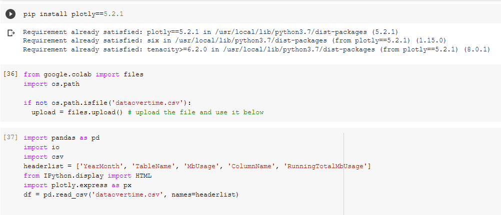
In our first code block ([25]) we install plotly==5.2.1 because of some newer and nicer features, setup the file upload of the csv([36]), and define the headers because SSMS is too lazy to include headers([37]).
Installing pre-reqs and uploading files.
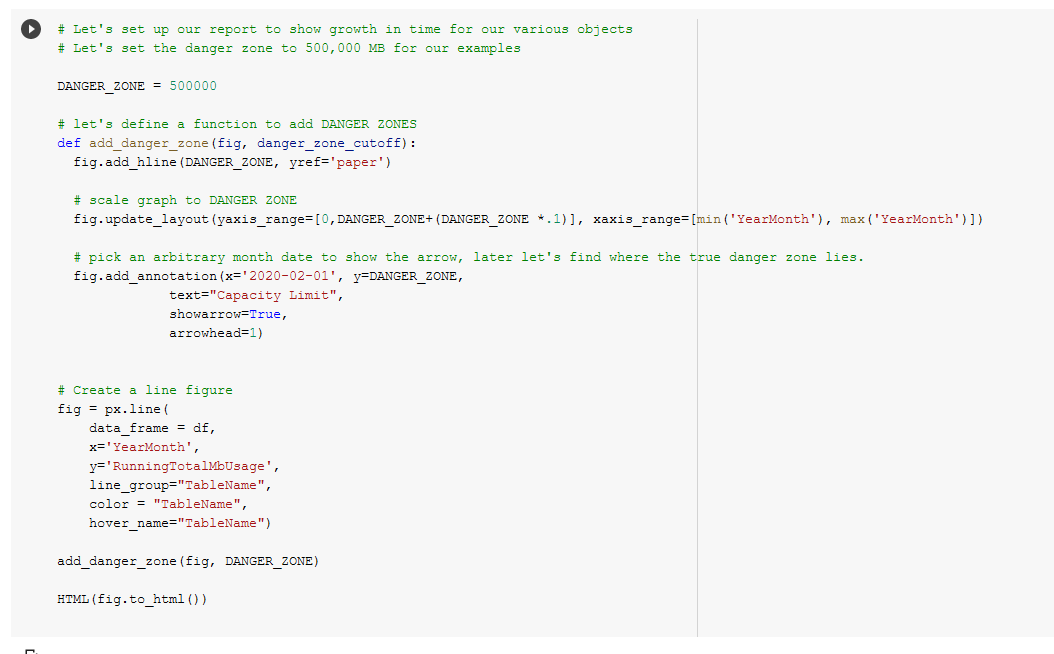
Next in code block ([38]) we define a DANGER_ZONE, the constant that should make us very worried because that’s how much space we have (in megabytes), and add a function to add DANGER_ZONES to figures easily.
Summarizing individual data tables
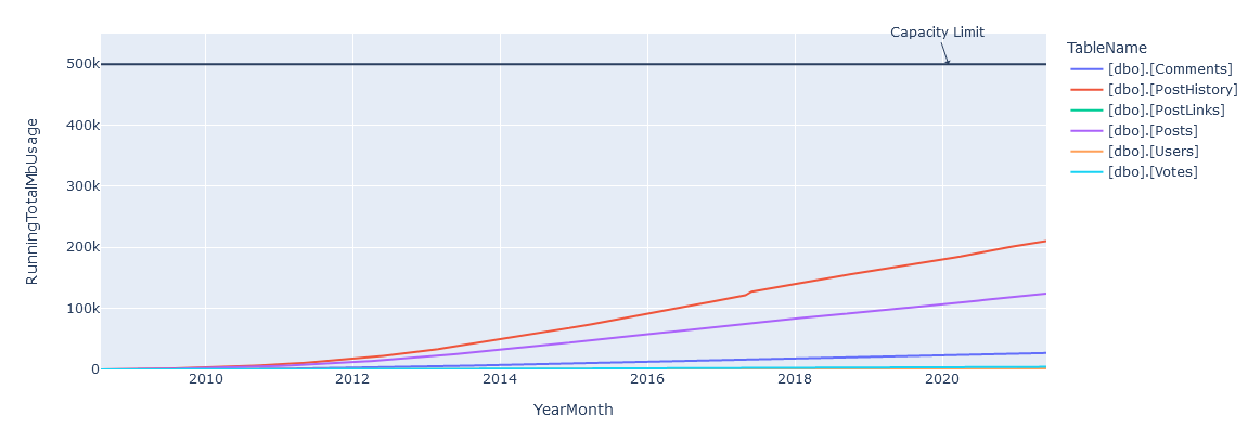
We make a line figure, render it, and we see something!
DANGER ZONE added with tables.
We’re obviously not done yet, we’re going to need add some data to predict when this is going to fail.
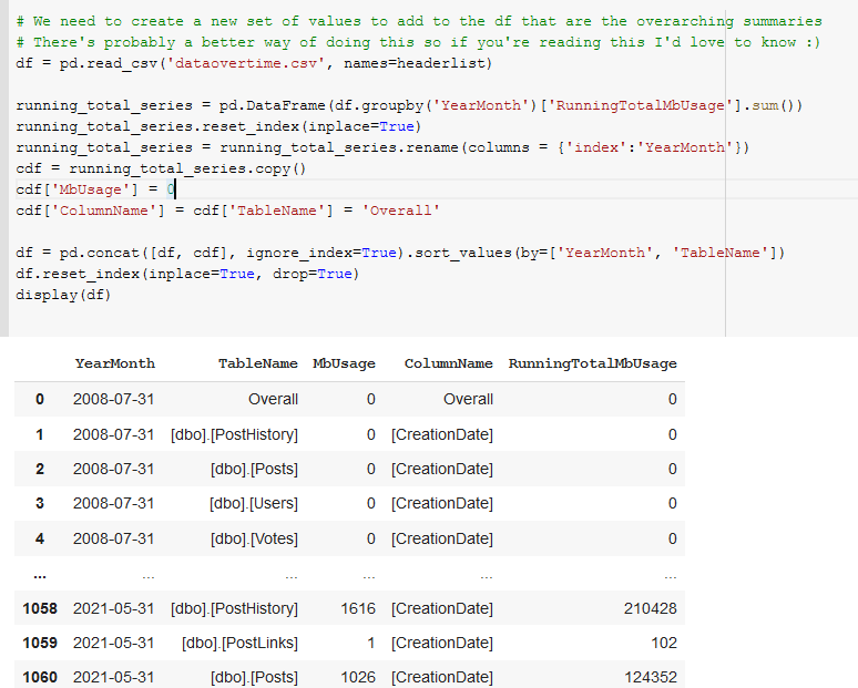
In code block([39]) we sum and group the RunningTotalMBUsage values such that we get an overall value for each month’s total megabytes for all tables.
Add overall summaries of the values to the dataframe.
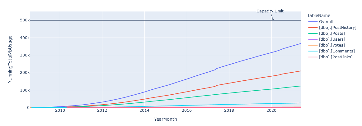
And happily in code block([135]) we see that we have our overall graph looking good, though obviously its a bit closer to our DANGER_ZONE!
Add overall summaries of the values to the dataframe.Overall line added to the graph
Finally, in code block ([136]) we take all the lessons we’ve learned and project out a set of points to determine what a linear best fit line would look like.
Regression fit again actual measurements.
Conclusions
Given a 500GB limit, we can see that a prediction of April 30th, 2026 is given for Stack’s storage being overwhelmed – and if you look closely you can see that Stack’s growth of data isn’t strictly linear, so it’s probably going to happen sooner than that. In reality I bet they have at least twice as much as that available 🙂
I had a good time using Colab, and the only frustrating moment during the process was when my sign in timed out, it silently switched me to a new login context and couldn’t save, porting that back over got annoying for a bit. Otherwise its great!
Feel free to copy/fork my notebook if you want to make the same predictions for you environment and try it out for yourself, I know I will. And if you were wondering, yes, I was listening to Kenny the entire time.