No, not Azure Data Studio or Databricks notebooks (yet) – I wanted to give Google Colab a spin and the big G hosted Jupyter notebook has an expansive free tier with more RAM than my work computer and a graphics card attached to boot!
Keep in mind its almost 500GB (zip + extract) – and while in an ideal situation we wouldn’t be torrenting a database, extracting, attaching, querying, etc to get at our insights I’ve honestly seen slower iterations at many enterprises so it wasn’t a big deal for me.
If you’ve never used Stack’s database its worth mentioning you an also avoid this all by running queries on their own servers at the Stack Exchange Data Explorer. There’s more tables there too!
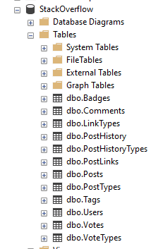
Turns out you can run a global website on 12 tables?
If you haven’t touched Stack’s database before you might be surprised how svelte it is, the backup I am working with only has 12 tables. That’s right, just 12.
The truth is that you don’t need to make things complex to make a useful product, and of course Stack/Brent have removed some ancillary and internal things which is fine by me.
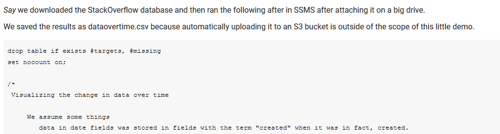
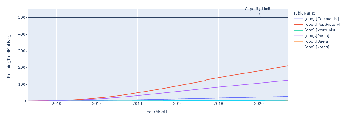
The first question I wanted to model out was a bigger issue with on-premises databases – when are we going to run out of storage?
Back in the day I’d cheat with msdb backups, comparing compressed sized to actuals, and moving on. However I don’t have a historical reference for Stack Overflow… so what can I do?
Taking a look at the tables we see a commonality in many tables – CreationDate! It looks like the rows faithfully are stamped when they are created.
We might not be able to truly look back in time but if trust the database we have a chance to query the contents and get back some interesting data about Stack.
So let’s head over to the notebook if you like, or sit back and read more.
Initial overview of the SQL Script
The first text block contains the dynamic SQL to query the tables with CreationDate and construct additional queries to run – I could have automated this or added a cursor but given I am running it locally in SSMS and copying the CSV by hand today, it wasn’t worth it.
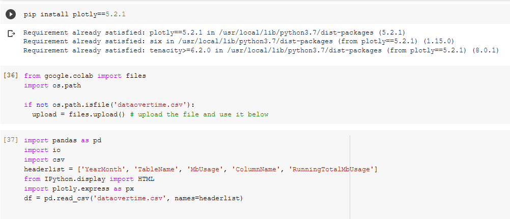
In our first code block ([25]) we install plotly==5.2.1 because of some newer and nicer features, setup the file upload of the csv([36]), and define the headers because SSMS is too lazy to include headers([37]).
Installing pre-reqs and uploading files.
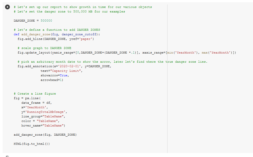
Next in code block ([38]) we define a DANGER_ZONE, the constant that should make us very worried because that’s how much space we have (in megabytes), and add a function to add DANGER_ZONES to figures easily.
Summarizing individual data tables
We make a line figure, render it, and we see something!
DANGER ZONE added with tables.
We’re obviously not done yet, we’re going to need add some data to predict when this is going to fail.
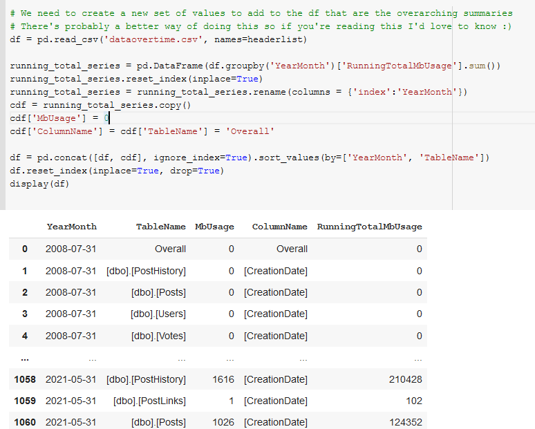
In code block([39]) we sum and group the RunningTotalMBUsage values such that we get an overall value for each month’s total megabytes for all tables.
Add overall summaries of the values to the dataframe.
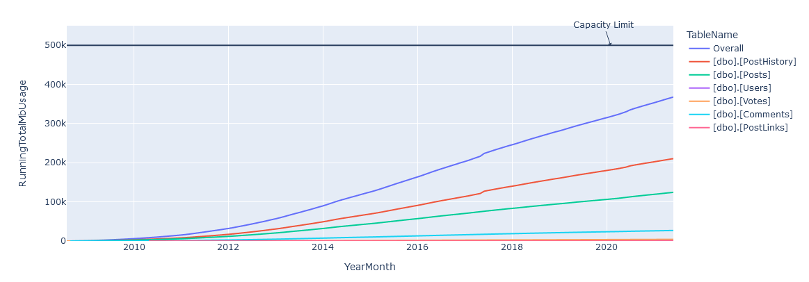
And happily in code block([135]) we see that we have our overall graph looking good, though obviously its a bit closer to our DANGER_ZONE!
Add overall summaries of the values to the dataframe.Overall line added to the graph
Finally, in code block ([136]) we take all the lessons we’ve learned and project out a set of points to determine what a linear best fit line would look like.
Regression fit again actual measurements.
Conclusions
Given a 500GB limit, we can see that a prediction of April 30th, 2026 is given for Stack’s storage being overwhelmed – and if you look closely you can see that Stack’s growth of data isn’t strictly linear, so it’s probably going to happen sooner than that. In reality I bet they have at least twice as much as that available 🙂
I had a good time using Colab, and the only frustrating moment during the process was when my sign in timed out, it silently switched me to a new login context and couldn’t save, porting that back over got annoying for a bit. Otherwise its great!
Feel free to copy/fork my notebook if you want to make the same predictions for you environment and try it out for yourself, I know I will. And if you were wondering, yes, I was listening to Kenny the entire time.
Over the last few years moving into more senior data roles I’ve gone from schlepping spreadsheets back and forth to having to justify and plan long term projects, simply distributed systems to management, and monitor for impending doom (ORDER BY most_impending).
Working through those problems I have found (mostly in desperation) that visualization allowed me to communicate much more easily than words alone, and meetings around problem solving ended much more quickly when we had a viz to hang our thoughts on.
This work didn’t happen overnight, so I wanted to share some resources I love as well as some practical implementation work.
Picture it: We’re in a brand new startup, working hard solving the problems of the day.
An influx of capital occurs, and huge televisions are purchased for all our new fancy dashboards we are going to create!
We start focusing on throwing up our immediate service issues, but with a few days of work the boss sees our progress and comes over. They ask us to include the current key performance indicators for the team, it seems like an ok fit, and we do.
The big boss comes down from the most recent sales meetings, sees the work, and calls it good.
Soon people are using the visualization to have discussions and make decisions. This gets noticed. People start asking you to include random metrics to the dashboard to help solve a specific issue, or track the progress of a team.
You make it work, but as the requests start piling up you break down and say “enough is enough!” and everyone’s confused – can’t we just add one more?
More information doesn’t mean better results – it just means more stuff to mentally juggle while you look for what you care about.
Sitting in the car of a Citroen GSA Pallas, the controls are on weird jutting extrusions coming from the dash towards the steering wheel. WHAT IS HAPPENING?Aerospace Lancia Beta Trevi – 29 holes with no idea what any of them mean. Less is more.
A common request I’ve heard is that we need a “Universal Dashboard” but if you’ve ever attempting to build one it will soon look like the dashboards in these cars, covered in dials and knobs nobody knows how to use and is probably afraid in many cases to even operate.
Instead of adding the kitchen sink of data, consider starting a new dashboard with asking Who, Why, and How.
Who is going to use this dashboard?
Know the audience for the information and have a sense of the model of the system they are observing.
Why are they going to use it? What problem are they trying to solve?
Are we trying to improve sales, adhere to a service level objective, or track some more ephemeral goal? Remember, we’re not trying to include something based on requirements, we’re trying to solve an actual problem.
How will we fix the problems we find?
This may be significantly harder to identify, and in a dashboard context the answer might just be “page X if Y is above 50% for 5 minutes” or “Buy more servers if capacity X drops below Y” but if you cannot form a plan of action from something you are showing, you probably can toss it.
Choose your display.
Consistent language is extremely important in any communication, and visual mediums are no different. When someone has the urge to increase the complexity of a viz everyone suffers.
Choosing a simple method to communicate what’s happening is critical for “at a glance” reporting.
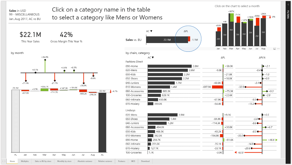
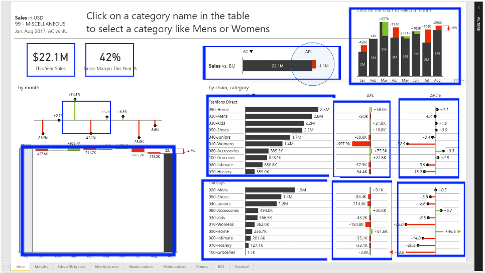
Let’s take a look at a “good” dashboard example posted online and see what display we’ve chosen and what consistent language we can distill below.
A “good” dashboard that still is pretty busy.
We have some consistency in color (red bad, green good, black normal) but there’s plenty of improvements to be made here… we can see at least 10 different components.
The “good” dashboard still does too much for my tastes.
We have a food court approach to visualizations; picking a mix of vertical and horizontal charts, waterfall charts, etc – at a glance it’s not clear to me whether performance is good or bad.
I see we have a big green thing in the top right? that seems like a lot of green! I see some red… but what does it all mean together? Is 42% a good gross margin? Some industries that would be great, others awful.
This might have met the requirements for the client’s request, but given we can see 9 tabs below this one implies managing this dashboard could be several full time jobs.
Eliminate Clutter.
It’s might be tempting to make your dashboard “cool” or “compact” or low contrast but when you pack that clutter into your UI you increase the cost for every human lookup. New people are not welcome here.
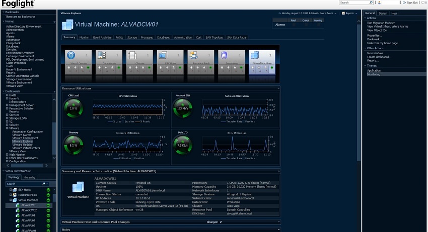
If you ever used the old Dell Foglight UI then you know what I am talking about.
Given the mental burden we put on our users, ask yourself these questions:
Does this element of the data we are showing service the narrative?
Can you shorten while remaining unambiguous?
Why, instead of why not?
Is there a simpler way?
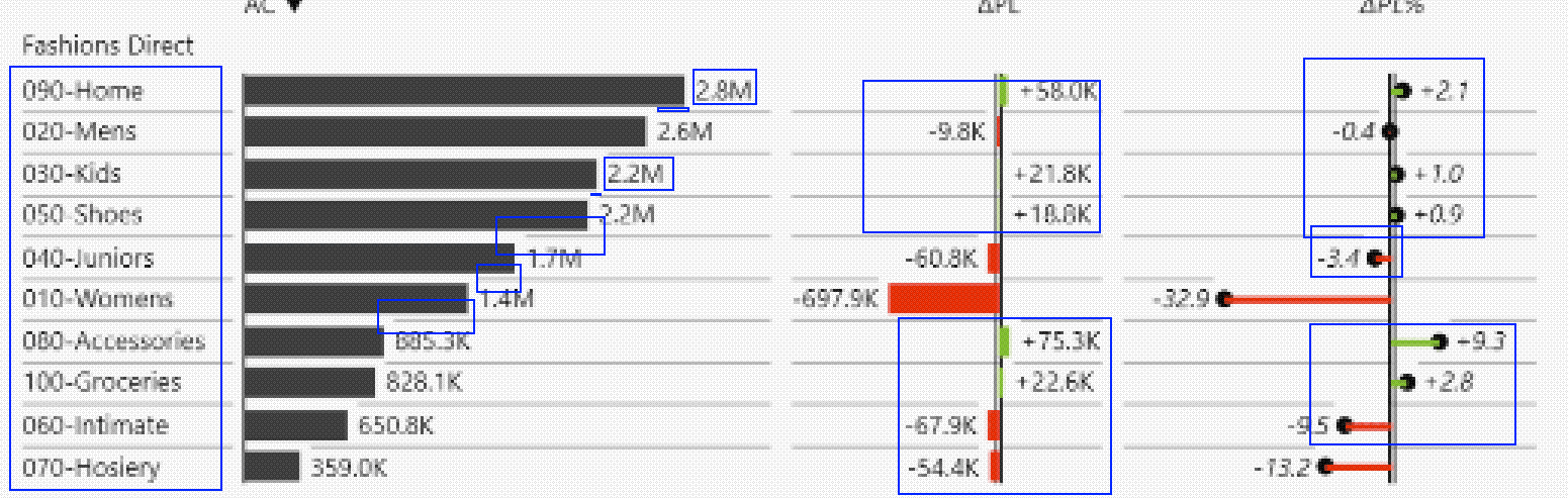
Checking back into just one section of our example dashboard:
In this subsection of the report we often see just a tiny smear of red or green – a lot of space is taken up by useless/invisible data.
There’s no clear reason why we want the line of business doing well and not doing well just generally laid out; immediately breaking down the failing lines of business would yield more value.
We see visual guide lines added to they add a lot of visual noise with the small fonts.
We have both a dollar and percentage change, it seems like a pure dollar would work fine in this case and save half the space.
We have a label that has an alphanumeric identifier when probably just one of those would do.
As with many of these report sections it has the wonderful property of having enough information to make you ask questions but give few answers or leading indicators of a problem except pure profitability.
Draw attention where you want it.
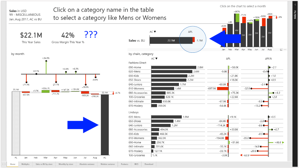
Where’s your eye drawn here? (cheating, I know.)
The big black bar on the lower left takes up so much space that I first thought it was dividing up the page until I saw the off-grey/white bar on the far left. It’s so visually uninteresting that I did not include greys as part of the color palette.
The other obvious first place is visually interesting – red, blue, and black with the only circle on the page.
I have no idea what that circle is trying to tell me, and I constantly find myself shifting to the right to see the bar graph that wants to exist in both the header and the content.
Remember to be very intentional with your colors, shapes, and especially the “flow” of your viz. Storytelling with Data emphasizes this multiple times and recommends taking a look at both the horizontal flow and the vertical flow for anything that throws off simplified visual processing.
Think like a designer.
Take a step back and review up to this point the goals you started out with and the destination you’ve arrived it.
Focus:
If you don’t make decisions based on this metric it probably should be on your dash.
Reconsider the visual gestalt, there’s so much on this we don’t really know what job function this would even be useful for.
Display:
Red and green are darlings of “simple viz” but are not accessible for colorblind users. If your dashboard requires the use of color, utilize color-blind friendly colors to ensure your data is accessible to all of your users.
I would consider changing the granularity of this reporting altogether (if the underlying data exists.) In the world of e-commerce having just month by month numbers to drive decision making is not impressive.
It’s also worth asking if PowerBI is the right solution for your problem. There’s a lot of other options for displaying your metrics out there and PBI is a fairly expensive one for the purpose – if you want eye candy then you probably would want to consider spending more time addressing the visual deficits here.
You’re telling a story.
This dashboard serves to tell a user the story of the business’s successes and failures of meeting financial goals. However, the lack of focus makes it difficult to understand what exactly that story is. Focus your story and ensure your graphics are necessary, useful, and accessible to your target audience.
Wrapping it up
I’d like to write more on the topic (and will in the future) but for today it’s gotten verbose and usually I set a flag for that. I leave you with some free (and one paid) tool to try out and remember
draw.io – (free) Download the desktop client and save once, it will auto save forever after that.
Mermaid.js -(free) An awesome little graphiz implementation with an online editor.
yFiles – (no affiliation) I’ve been meaning to put this in a project in the future, it’s the same viz library IntelliJ uses and I LOVE it for database work that I have been doing recently.